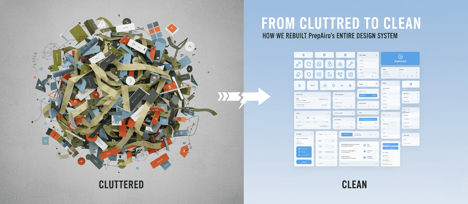
From Cluttered to Clean: How We Rebuilt PrepAiro’s Entire Design System
9 min read
Feb 07, 2026
By Dyanil, Founding Product Designer at PrepAiro
 PrepAiro started as a gamification-heavy UPSC preparation app. XP points. Badges. Leaderboards. Daily challenges. Streaks. We had it all. The idea was simple: make studying feel like a game, and users will keep coming back.
They did come back. But something was wrong.
Users were opening the app daily. They were earning XP. They were climbing leaderboards. But when we looked closer, we realized: they weren’t actually using the app for its real purpose.
The app was colorful. It was gamified. It was engaging. But it was also overwhelming, confusing, and visually exhausting. Users were getting lost trying to find basic features.
This is the story of our mobile app redesign journey, how we stripped everything down and rebuilt PrepAiro from scratch with cleaner visuals, simpler navigation, and a design system that finally made sense.
Why We Needed a Mobile App Redesign
On paper, our metrics looked healthy. Daily active users were steady. Session times were decent. Gamification was doing its job, users were hooked.
But engagement isn’t the same as effectiveness.
When we dug deeper through user interviews, feedback analysis, and usability testing, the cracks started showing. And they were bigger than we’d imagined. Our app had three major problems that no quick fix could solve.
Problem 1: Visual Noise Was Draining Users
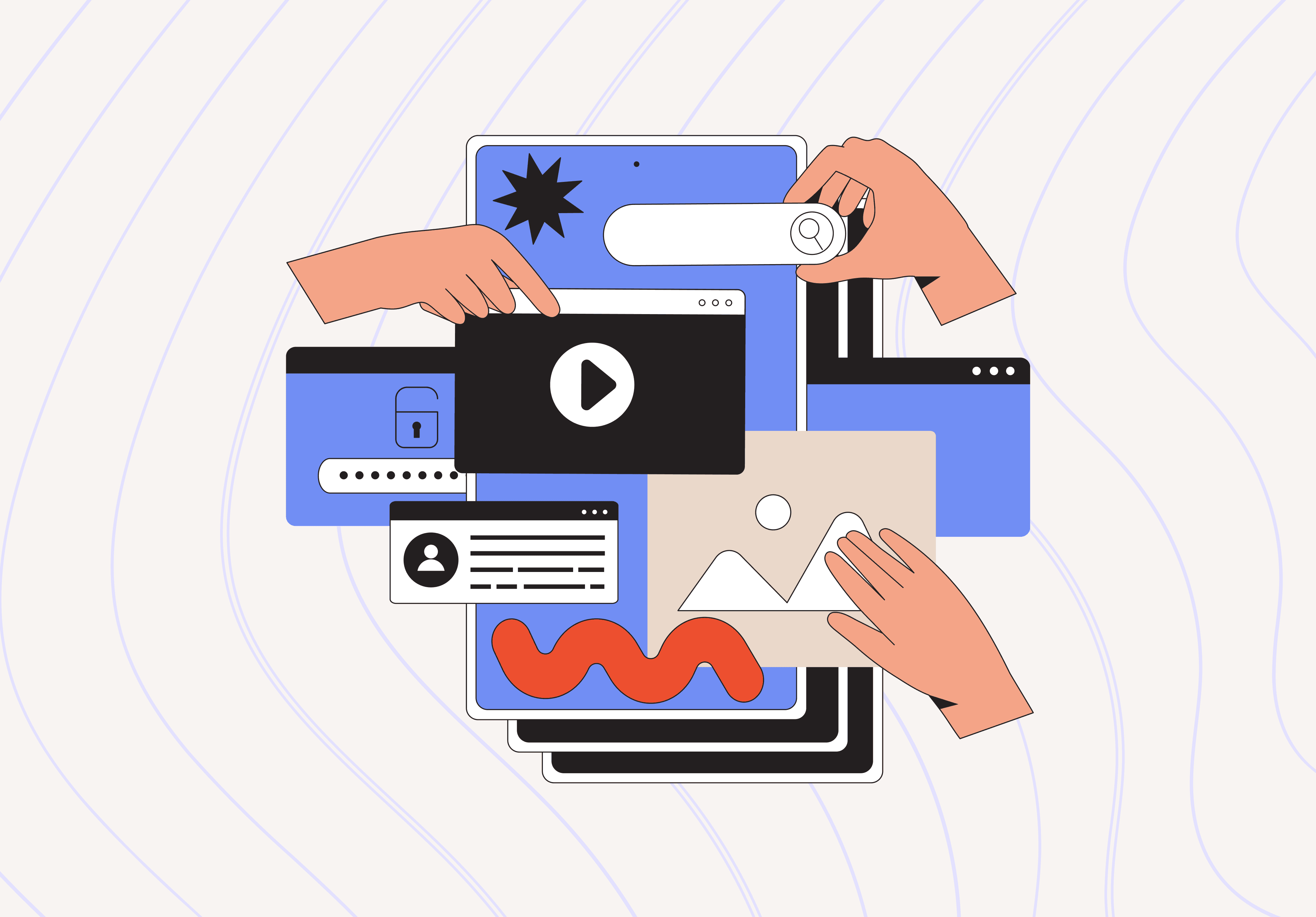
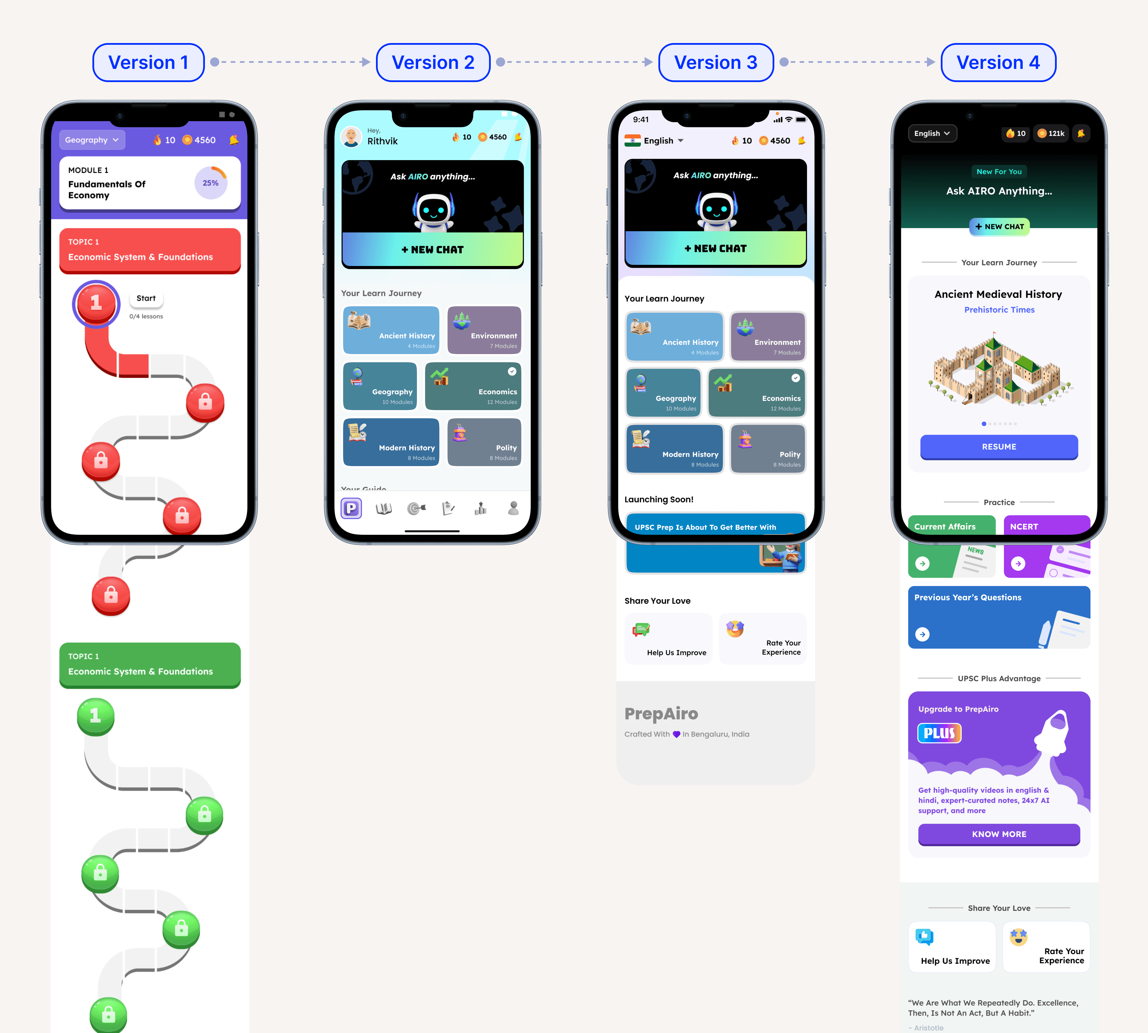 All versions of old UI home screen showing multiple bright colors competing for attention
Our UI was loud. Every screen had multiple bright colors fighting for attention: blues, oranges, greens, purples, all at full saturation, all at once and in every screens.
In design, we call this visual noise. It’s when there’s so much competing for your eye that your brain can’t figure out what to focus on first. Every color screams “look at me!” and the result is cognitive overload, your users get tired before they even start using the app.
Users described the app as “too much” and “overwhelming.” Some were more blunt: “It looks like a children’s game.” A few even called it ugly.
That feedback hurt. But they weren’t wrong. When you’re trying to focus on something important, the last thing you need is an app that tires your eyes before you even start.
Problem 2: Confusing App Navigation
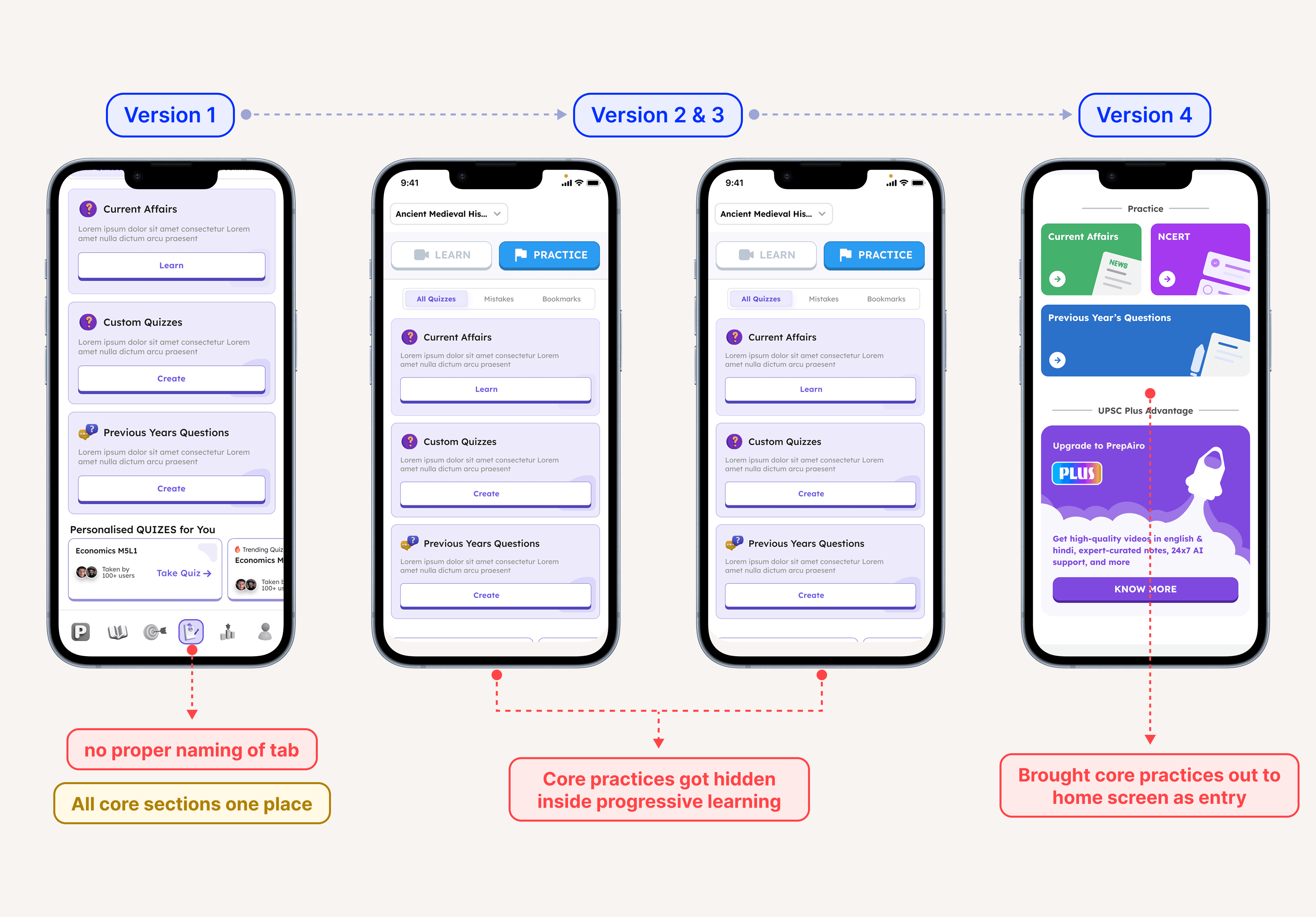 Confusing app navigation with core practices hidden in multiple menus
Users come to PrepAiro for specific things: NCERT content, Previous Year Questions (PYQs), Current Affairs, and structured practice. These are the core features that matter most.
But users couldn’t find them.
25% of our users reported difficulty navigating the app and understanding where to find what they needed. Navigation was scattered everywhere, some features in a side drawer, others behind tabs, some buried two or three taps deep.
We tried fixing it. Multiple iterations. Different layouts. Rearranged menus. Nothing stuck.
The problem wasn’t the menu placement. The problem was the entire navigation architecture, users had to think too hard to find basic features. And when users have to think too much, they leave.
Problem 3: Gamification Was Distracting From the Core Purpose
We had built PrepAiro around gamification. XP points, daily streaks, leaderboards, badges, goals, the whole playbook that apps like Duolingo made famous.
The problem? Gamification had stolen the spotlight from actual value delivery.
Video lessons and core content existed, but they weren’t the focus. Users were chasing streaks and climbing leaderboards, not actually getting value from the app. The dopamine hits from earning XP felt good, but they weren’t translating into real outcomes.
We had accidentally built an app that was fun to open but wasn’t delivering on its core promise.
The Decision: Stop Patching, Start Rebuilding
We had two options:
Option A: Keep iterating on the existing design. Fix navigation here. Tone down colors there. Small improvements over time.
Option B: Throw away the old design system and rebuild everything from scratch.
We chose Option B, a complete mobile app redesign.
Not because we wanted to, rebuilding is painful. It means admitting that months of previous work wasn’t good enough. It means starting over while your users are still using the broken version.
But sometimes the foundation is the problem, not the details. No amount of small fixes would solve the core issues we’d identified. We needed a new design system, a new navigation structure, and a new philosophy about what our app should actually be.
Our Mobile App Redesign: What We Actually Changed
Change 1: From Visual Chaos to Intentional Color
The old app had bright colors on every single screen. Every element competed for attention.
The new design keeps our primary color palette, we didn’t abandon the brand identity. But now colors are used intentionally. They guide attention instead of fighting for it.
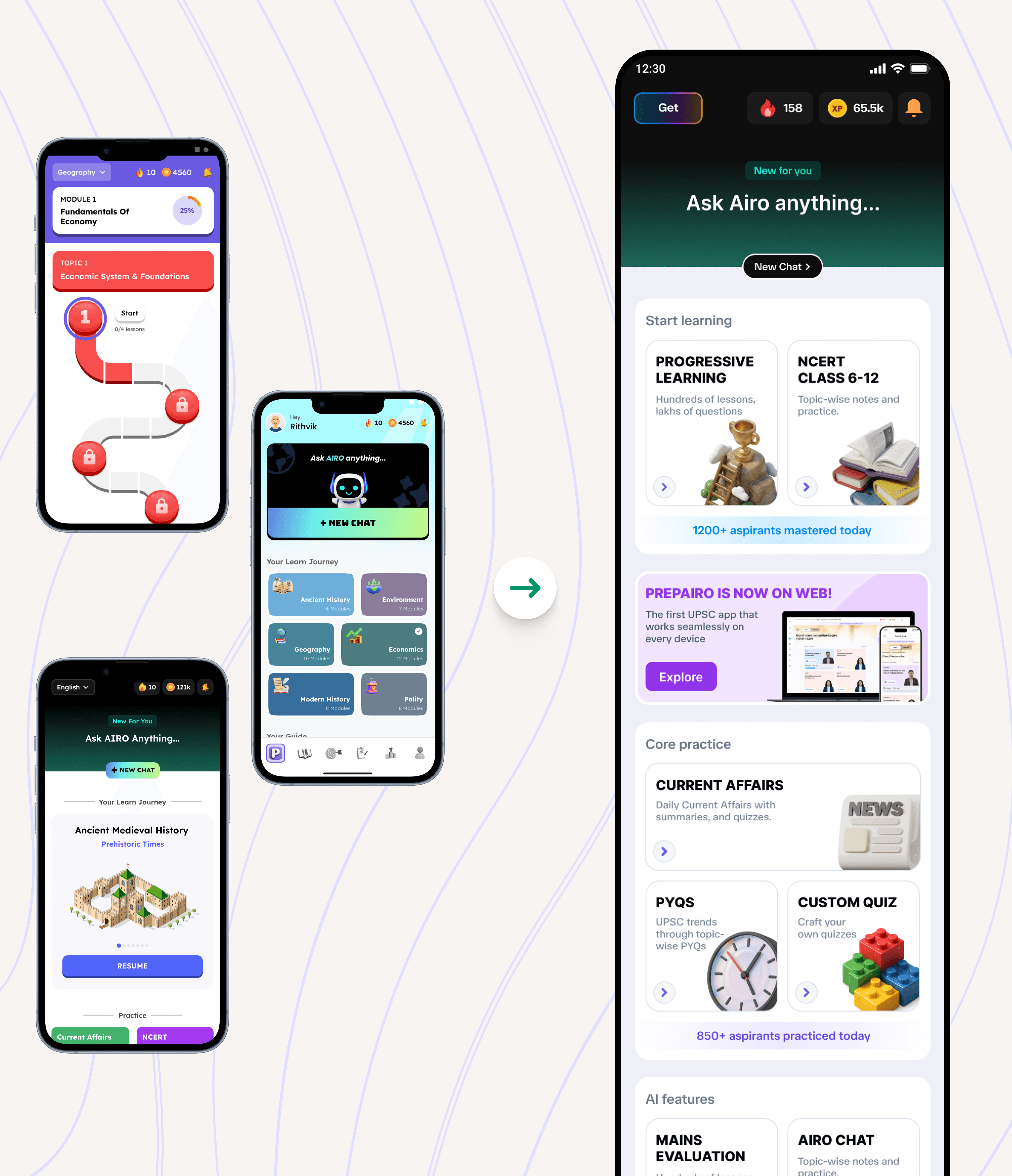 Redesigned app home screen by also solving app navigation
We reduced saturation in places where color wasn’t needed. More whitespace. Cleaner visual hierarchy. The colors that remain now actually mean something, they highlight important actions, indicate progress, or draw attention to what matters.
The result? A modern, sophisticated look that users can actually spend hours with without feeling visually drained.
Change 2: Fixing App Navigation with Bottom Bar
This was the biggest UX shift in the entire app redesign.
Previously, core features were buried. Users had to hunt for them through side drawers and nested menus.
Improved mobile app navigation with clear bottom bar showing main features
Now? Everything lives in a 6-tab bottom navigation bar:
• Home: Dashboard with daily goals and quick actions
• Progressive Learning: Structured video lessons and courses
• NCERT: All NCERT content, one tap away
• PYQs: Previous Year Questions organized by year and subject
• More: Profile, Progress and achievements
One tap access to what matters most. No guessing. No digging. This simple change in mobile app navigation solved 25% of our user complaints overnight.
This wasn’t a revolutionary idea, bottom navigation is a well-established pattern. But that’s exactly why it works. Users don’t have to learn anything new. Their mental model, the internal map of how they expect an app to work already understands bottom bars. We stopped fighting user expectations and started designing with them.
Change 3: From Gamification-First to Value-First
We didn’t kill gamification. We repositioned it.
Streaks, leaderboards, goals, XP they’re all still there. But they now support the core experience instead of replacing it.
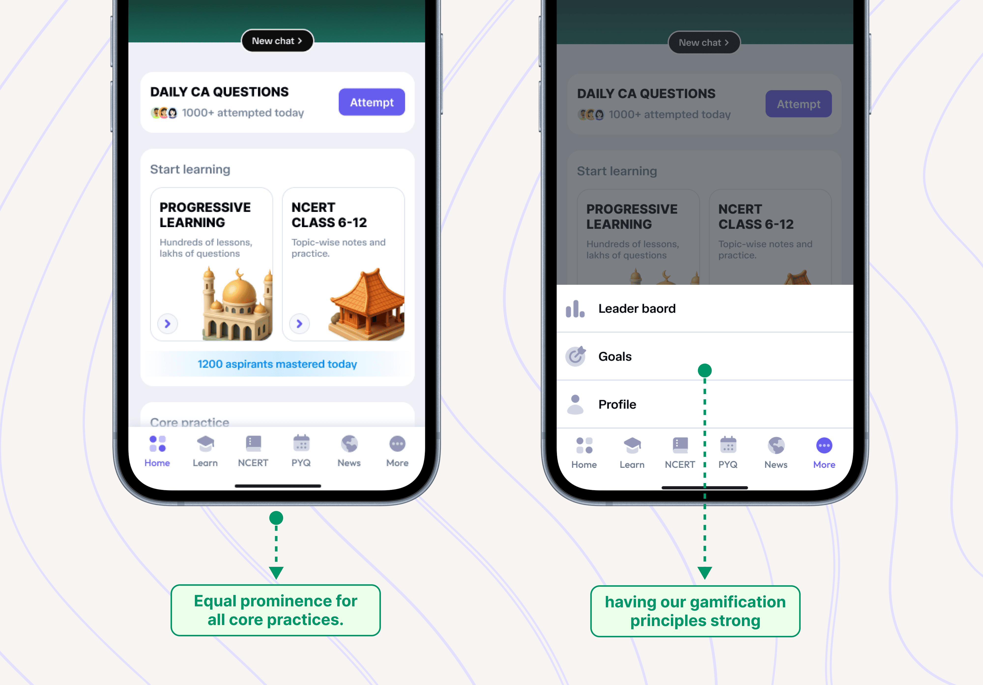
Redesigned app interface with video lessons prominent and gamification elements supporting
Video lessons are now the core of PrepAiro. When you open the app, the emphasis is on learning structured courses, progressive modules, actual preparation content.
Gamification elements now serve as motivation boosters, not the main event. They reward consistency. They celebrate progress. But they don’t distract from the actual goal.
The mindset shift: Gamification should amplify your core value, not compete with it.
Testing and Iterating: How We Got It Right
We didn’t ship the redesign and hope for the best. Every major change went through testing.
The bottom navigation structure? Tested with real users before implementation. We watched people try to find core features, timed how long it took, noted where they got confused.
The color adjustments? Iterated multiple times based on feedback. Too muted felt lifeless. Too bright brought back the old problems. We found the balance through trial and error.
The video lesson flow? Refined based on how users actually moved through content, not how we assumed they would.
Good design isn’t about getting it perfect the first time. It’s about listening, adjusting, and improving until the experience feels effortless.
The Results: What Changed After Our App Redesign
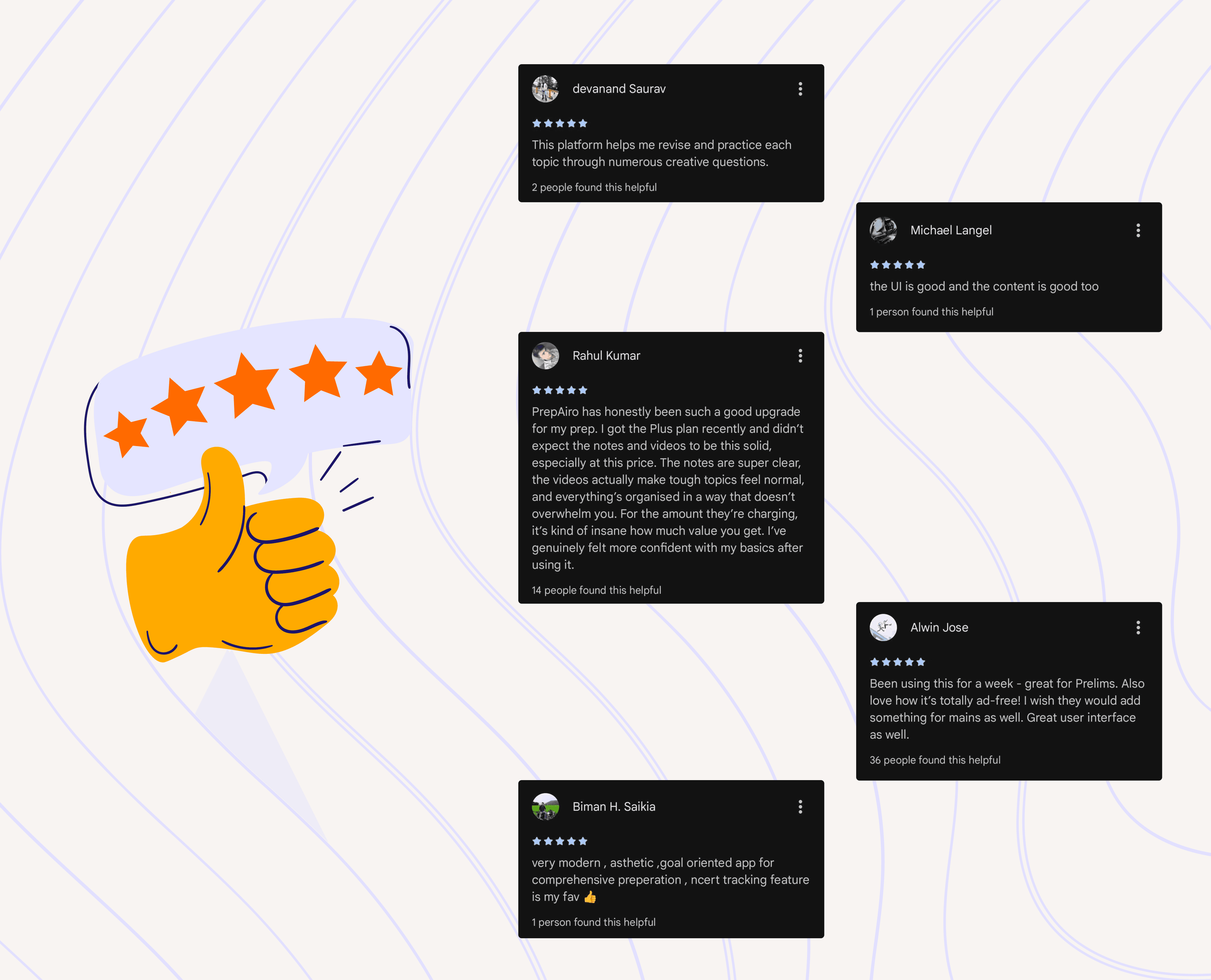
PrepAiro app store rating improvement from 4.0 to 4.4 stars
The feedback after launch was immediate and clear.
App Store rating improved from 4.0 to 4.4 stars, a significant jump that reflected genuine user satisfaction, not just engagement tricks.
UI and flow complaints dropped from 4–5 regular issues to essentially zero. Users stopped telling us the app was confusing. They stopped asking where to find features. The noise disappeared.
The 25% of users who struggled with navigation? Problem solved. With core features one tap away in the bottom bar, the confusion evaporated.
But the most telling changes were in the in-app reviews:
• “Very modern app”
• “Clean and easy to navigate”
• “Finally, I can find what I need”
• “Best app I’ve used soo far” ,etc…
Users weren’t just tolerating the app anymore. They were appreciating it. The mobile app user experience had shifted from exhausting to intuitive.
Key Takeaways from Our Mobile App Redesign
Rebuilding PrepAiro wasn’t just a project, it was a series of lessons about what good design actually means.
Colorful Does Not Mean Better
More colors don’t make an app more engaging. They make it more exhausting. Visual design should reduce cognitive load, not increase it. Use color with purpose, not just for decoration.
Navigation Can Make or Break Your App
If users can’t find your core features in 2 seconds, your app has failed no matter how beautiful the rest of it looks. Simple, predictable app navigation isn’t revolutionary, but it works because it matches how people already expect apps to behave.
Engagement Metrics Can Be Misleading
Users opening your app daily means nothing if they’re not achieving their actual goals. We had to be honest about what our metrics were actually measuring versus what actually mattered.
Sometimes You Have to Start Over
We tried fixing the old design. Multiple iterations. Nothing worked because the foundation was broken. The real breakthrough came when we accepted that incremental improvements weren’t enough, we needed a complete app redesign.
Final Thoughts
Rebuilding PrepAiro wasn’t easy. We had to let go of a design we’d invested months into. We had to accept that our original vision gamification-first, colors everywhere wasn’t serving our users.
But that’s what good design demands.
Listening to users, even when the feedback hurts. Making hard decisions. Starting over when the foundation is broken. Putting user goals ahead of vanity metrics.
Today, PrepAiro is cleaner, faster, and more focused. The app looks modern. Navigation makes sense. Core content is front and center. And most importantly users are actually getting value from it.
That’s the only metric that matters.
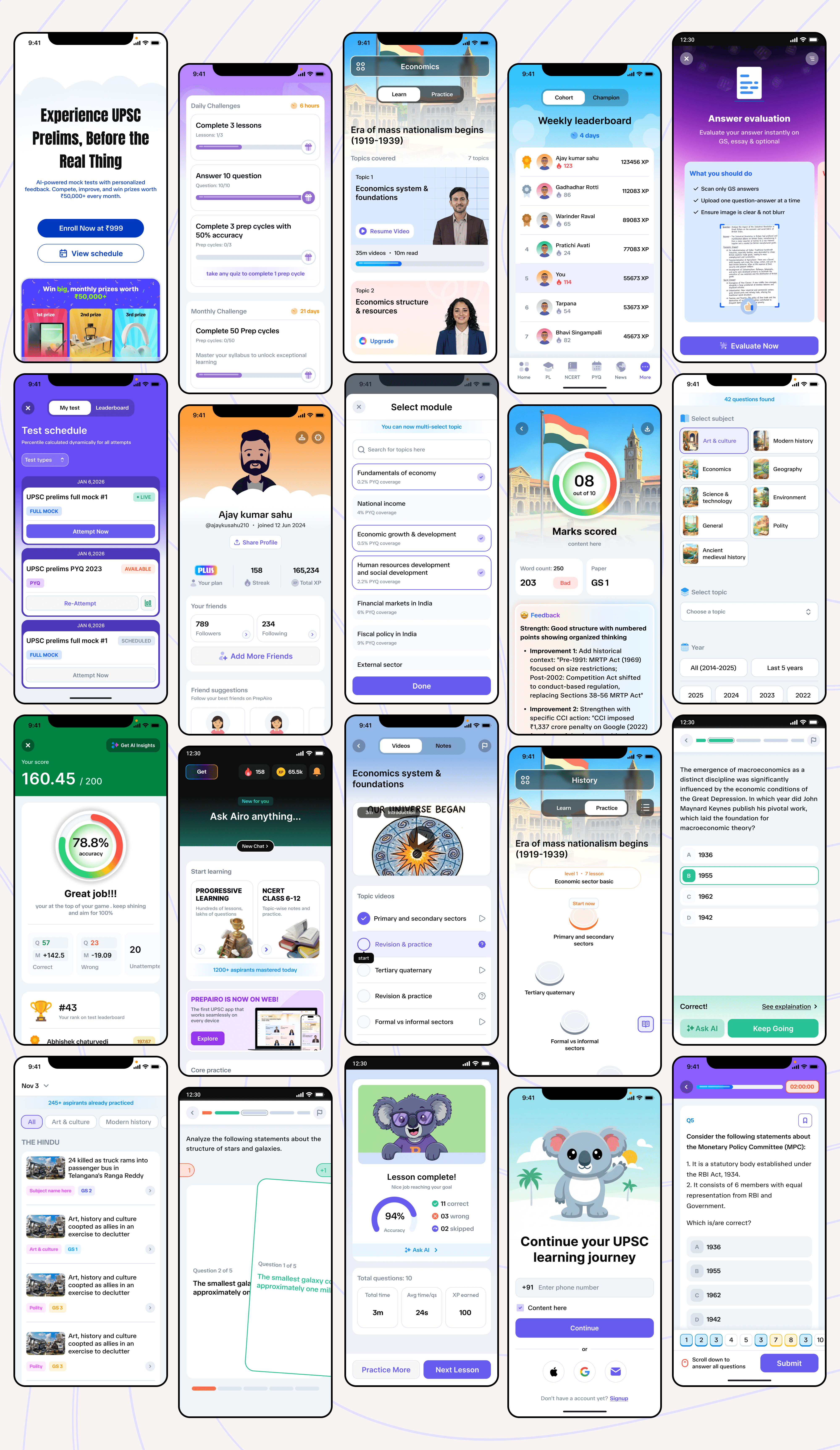
Redesign showcasing clean modern interface across multiple screens
Frequently Asked Questions
How long did the mobile app redesign take?
The complete redesign process from identifying problems to launching the new version took several weeks. This included research, multiple design iterations, testing, and development. Rushing a redesign usually leads to missing important issues.
How do you know when your app needs a redesign vs small fixes?
If user complaints keep coming back after multiple fix attempts, or if the core problems are architectural (like navigation structure or information hierarchy), you likely need a redesign. Small fixes work for surface-level issues, but foundation problems require rebuilding.
Did users complain about the changes?
Some users initially missed certain elements, but the overwhelming feedback was positive. Our App Store rating improved from 4.0 to 4.4 stars, and navigation complaints dropped to nearly zero. When a redesign genuinely improves user experience, most users appreciate it quickly.
What’s the most important thing to get right in a mobile app redesign?
Navigation. If users can’t find what they’re looking for within a few seconds, nothing else matters. Beautiful visuals and clever features mean nothing if the core user journey is confusing.
From This Blog to Your Phone
See what 100K aspirants are talking about, Download PrepAiro
Where your UPSC journey finds direction, Visit PrepAiro
Every chapter. Every subject. One tap away, Start reading NCERT
20+ years of UPSC questions, organized for you, start practicing PYQ Mains & PYQ Prelims
Never miss what UPSC might ask tomorrow, Click here to stay updated on current affairs
Learn at your pace, not someone else’s schedule, Start Watching
Know where you stand before the real thing, Take a Mock Test
Get your answers reviewed like UPSC would, Try Mians Evaluation
Doubts at 2 AM? Airo doesn’t sleep, Ask Airo
Your weak spots. Your quiz. Your rules, Build a Custom Quiz
Crisp notes that cut through the syllabus, Read Notes
Behind the scenes of building PrepAiro, linkedIn Instagram Youtube
Let’s talk on product & design, Dyanil on LinkedIn
100K+ aspirants are already preparing with PrepAiro. Join them, Download Now